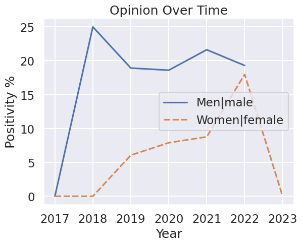
I created a program that uses python and ML to analyze my discord messages over the years and give insight into the things I say, data-science style. It revealed dark truths about myself - like how I’m racist, sexist, and have severe anger issues. What this graph shows is how often I talk about these things in a positive light. I used a ML text classifier to classify each of my messages as “positive”, “negative”, or “neutral”. If I want to find my overall feelings about cats, for example, then I filter my messages for only the ones mentioning cats and then I find the ratio of positive to negative messages. If most of my messages mentioning cats are negative, then clearly I do not associate good things with cats.
Many people were horrified at my results
The truth is that I was doing a little trolling to see how easy it is to manipulate data to create false or inaccurate conclusions. Manipulating the data is actually fairly easy, and I hope to use this lesson to become more skeptical when approaching data visualizations in the future..
Use Graphs
The number one thing you could do to fool people into believing you’re credible is to use graphs to make an illustration. Graphs are the tools of intelligent people, which we want to pretend to be.
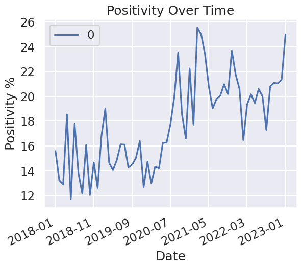
In addition, make the graphs as aesthetic as possible. Just like with Apple products and Teslas, people will often conflate apparent quality with actual quality. With matplotlib, this can easily be done using the seaborn package to make your graphs look prettier. With just 2 lines of code, you become 150% more credible.
Limit Access to Data
Do not give people access to the raw data. Only let them see the data after you have manipulated it to suit your motivations.
In my case, it was fairly easy to rationalize this due to the personalness of private messages. Regarding other forms of data, you can easily use logic such as “the need to maintain a competitive advantage” or “national security”.
Same data, graphed differently
The original graph shows the ratio between positive and negative messages. This graph shows the ratio between positive and (neutral + negative = non-positive) messages. Now, it shows that in 2022, I began liking women more. I truly became reformed.
It also shrunk the difference. Now there’s only a few % difference between how positively I talk about either category. I could technically say “I only talk about men 2% better than women” instead of the original 10%+.
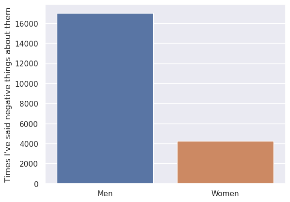
This shows that I’ve said more negative things about men than women (using the broader search term used in the next section), but this difference is inflated by the fact that I talk about men more than women.
Lie By Omission
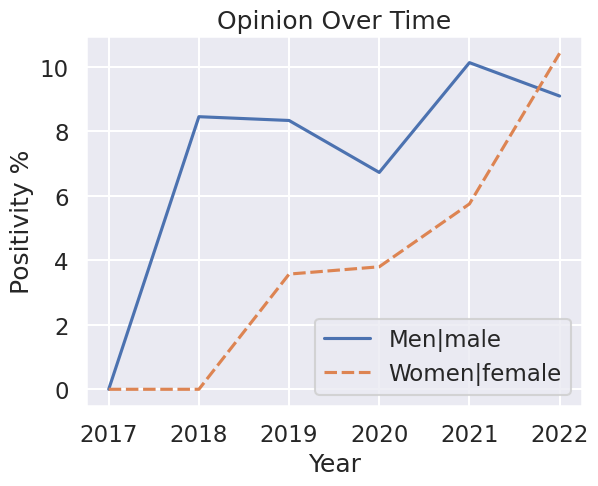
I should also note that the legend of the graph shows the keywords I looked for. I chose those keywords specifically because it gave the worst results. If you expand the search query even a little, this is what you get:
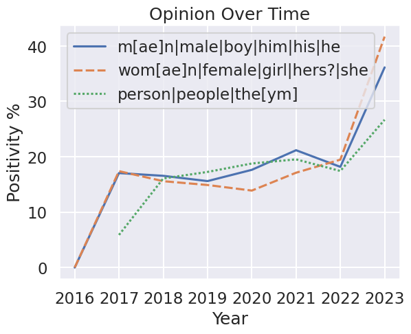
And this gives a much more neutral response than the original graph. I even added a gender-neutral line to show that I don’t really talk about men or women that differently than “people” as a whole. Selectively leaving out part of the data is a great way to get the results you want.
Lack of Data
I initially created this project just to see the ratio between my positive and negative messages overall. I have over 280,000 messages so I felt that it should be an accurate depiction of whether or not I generally speak in a positive manner.
Only when considering my messages as a whole (and after 2018 since I barely used discord before then) do I have a large enough dataset to be able to confidently attempt to draw a meaningful conclusion. When I filter my comments for specific keywords, it cuts the dataset down by several orders of magnitude. Here’s a pie chart comparing their sizes:
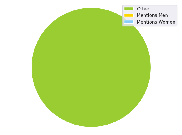
How many messages does it take to make me confident in the data? You’d have to study how large of a sample size you need before the data begins to converge. I didn’t do that, so I’m only guessing that 200 mentions is not enough.
Accuracy of Models
I used two ML models that categorize text into positive/negative sentiment, and general emotion. These models were pretty accurate on the data used to train and test them (which were largely reddit comments), but they do not seem to work well for chat comments.
| Message | Emotion | Sentiment | Note |
|---|---|---|---|
| men are like NFTs | neutral | negative | Opinion on NFTs is subjective, but this is based |
| men 🤮 | neutral | negative | Miscategorized emotion, should be “disgust”. |
| I need gifs of men shitting their pants | neutral | negative | Should be “desire”, and probably isn’t negative |
| Im a god among men | neutral | neutral | Definitely should be positive |
| my fascination for men’s crotches is what makes me [productive] | annoyance | positive | Definitely should not be annoyance |
| respect women | admiration | neutral | Definitely should be positive |
| gamers hate women and minorities | anger | negative | While you can see the categorizations are acceptable, it definetely does not reflect what I personally believe |
But, people would not inspect the data like I did. I told them I used a model that does something, but they never will take the opportunity of the outputs are an accurate reflection of the raw data.
Why Lie?
Because it’s funny.