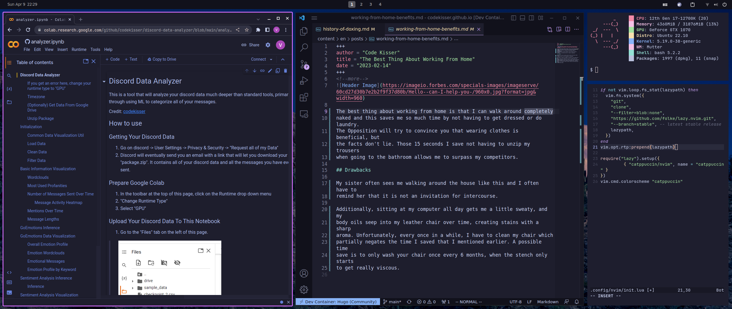
My desktop is looks like this solely for tactical reasons. Security experts never consider the fact that babies may utilize their small form-factor in order to sneak past physical defenses in order to enact harm upon their infrastructure.
I engineered my desktop specifically to maximize monochromatism while still being aesthetic and functional. Due to the stage in development human babies are at, at their young age, their have much difficulty discerning between details in monochrome sights [1]. If a baby managed to get physical access to my computer, their stupid feeble child mind would not be able to comprehend the UI due to the defenses I have set up. At my keyboard, they would be completely impotent, and they would have no choice but to shit themselves and cry like the babies they are.
It would not reflect well on the American people if stupid idiot babies were able to sabotage our equipment. Every computer in America should be set up like mine.
Furthermore, let this be a lesson as to why you should not use high contrast themes. Not only are they extremely ugly, but they will make you susceptible to baby attacks. The accessibility benefits are not worth the security risk.